devtools::install_github("MiriamLL/SeaDens")Custom points in a map
r
ggplot2
seadens
Y2023
Plot different size, color and shape points
Intro
Customize your plot using different sizes, shapes and colors in the points of your figures.
Data
Load or install the package SeaDens
library(SeaDens)Load data
The package contains data from a random generated density data frame.
density_df<-density_dfThe data frame contains latitude, longitude and density estimations.
To check the data lets use ggplot.
First call the library.
library(ggplot2)Then check the data contained on the data frame.
ggplot()+
  geom_point(data=density_df,
          aes(x = longitude,
              y= latitude))
Each of the dots contains density data, to check the values you can use the function range for the minimal and maximal values.
range(density_df$densities)Classify
Based on the range of the densities, define how many classes you want to use and where the cuts will be made.
class0<-0
class1<-1
class2<-2.5
class3<-5
Using the function mutate from the package tidyverse add a new column with a classification.
Note that using alphanumerical order is important for the order in the legend.
library(tidyverse)density_df<-density_df %>%
mutate(density_class = case_when(
densities == class0 ~ as.character("group0"),
densities >= class0 & densities <= class1 ~ as.character("group1"),
densities >= class1 & densities <= class2 ~ as.character("group2"),
densities >= class2 & densities <= class3 ~ as.character("group3"),
densities >= class3 ~ as.character("group4"),
TRUE~"U"))Check number of observations to make sure your classification was working and that you have at least one value per group.
density_df %>%
  group_by(density_class)%>%
  tally()
Define
To define the sizes, numbers can be used.
density_sizes<-c("group0"=0.5, "group1"=1,"group2"=2, "group3"=3, "group4"=5)To define the text on the labels, characters can be used.
density_labels<-c('0','> 0-1','> 1-2.5','> 2.5-5','> 5')class(density_labels)To define shapes, R uses numbers. Here, each group is assigned a different shape.
density_shapes<-c("group0"=3, "group1"=21,"group2"=21, "group3"=21, "group4"=21)For reference on the shape types:
Base plot
To visualize your data, create a base plot with defined shape, size and labels.
To define the shape and size, the argument was added inside the aes.
To assign the values and labels, fill the arguments scale_shape_manual and scale_size_manual.
ggplot()+
  geom_point(data=density_df,
          aes(x = longitude,
              y= latitude,
              shape = density_class,
              size= density_class),
              fill= "#d00000")+

  scale_shape_manual(values = density_shapes,labels=density_labels)+
  scale_size_manual(values =  density_sizes,labels=density_labels)
Add map
Since we need reference map, the package sf contains the function geom_sf that allows plotting shapefiles, and the package GermanNorthSea contains shapefiles from the North Sea readily available for use.
Call (or install) the packages
library(sf)
library(GermanNorthSea)
Some parameters need to be adjusted first, such as which CRS to use, and the limits on the map.
For more details go to: Mapping in R and GermanNorthSea
Here the parameters define that we are going to use CRS 4326, color the land in yellow and the water in blue, and define the coordinates to plot.
my_CRS<-4326
Europa<-sf::st_transform(German_land, my_CRS)
EEZ<-sf::st_transform(German_EEZ, my_CRS)
color_land='#f7bf54'
color_water='#3668b4'
xval<-c(3,9)
yval<-c(53,56)
Create a base map.
base_plot<-ggplot2::ggplot()+
    # maps
    ggplot2::geom_sf(data = EEZ, colour = 'black', fill = color_water)+
    ggplot2::geom_sf(data = Europa, colour = 'black', fill = color_land)+
    ggplot2::coord_sf(xlim = xval, ylim = yval)+

    NULL
base_plot
Add dots
Now add the density data on top of the base map.
density_wmap<-base_plot+
  geom_point(data=density_df,
          aes(x = longitude,
              y= latitude,
              shape = density_class,
              size= density_class),
              fill= "#d00000")+

  scale_shape_manual(values = density_shapes,labels=density_labels)+
  scale_size_manual(values =  density_sizes,labels=density_labels)
density_wmap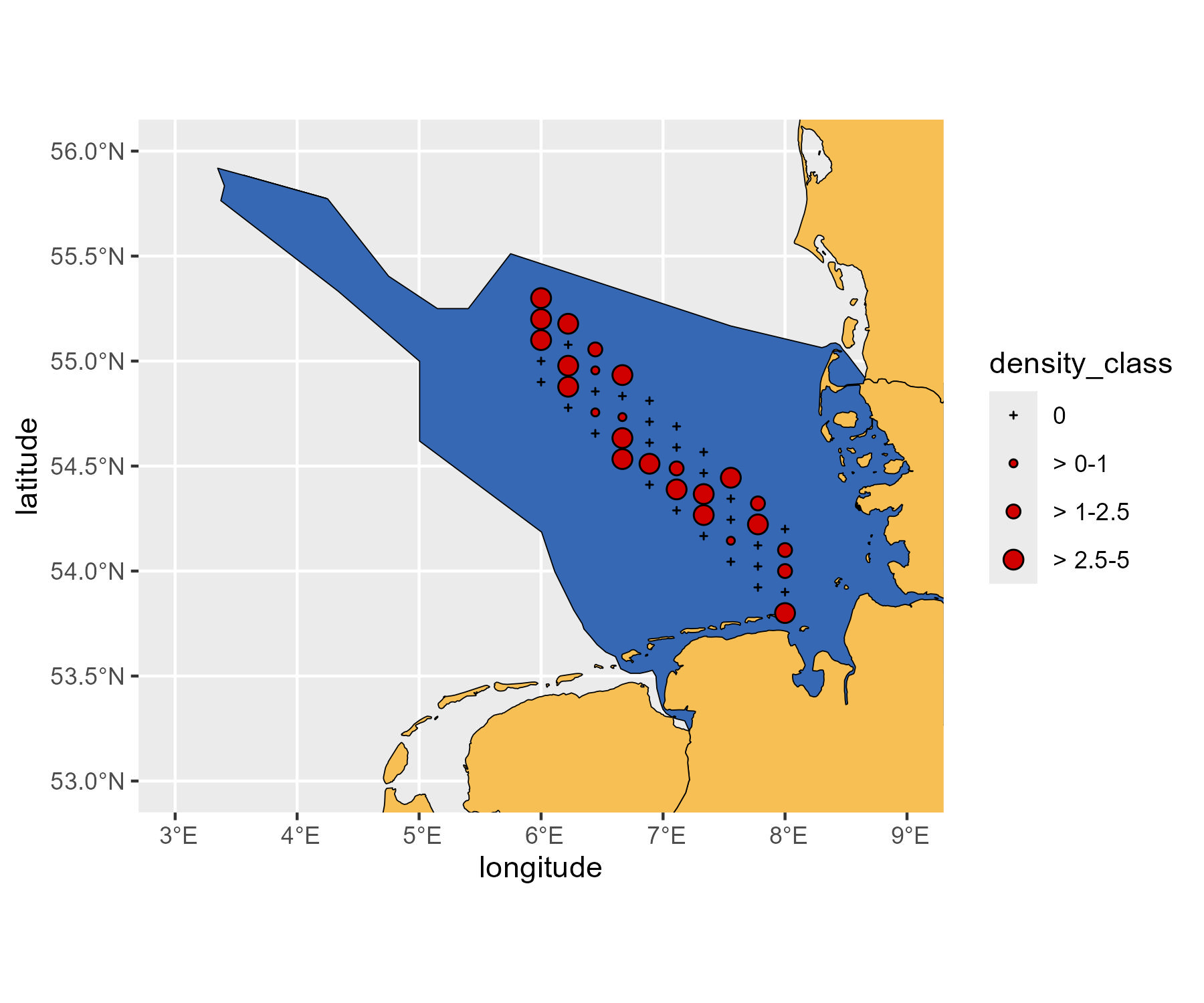
Now you have a base map with density information on different shape and size.
Further reading
These figures are based on the SAS monitoring program, but note that data was randomly generated and do not correspond to real survey information.
See the real maps here.