#devtools::install_github("MiriamLL/sula")
library(sula)Time overlaps
r
biologging
Y2022
Find overlapping time periods.
Intro
This post is about how to find overlapping times between your tracked individuals.
This might help you to:
- Identify periods where you have gaps for each individual, or
- To select which periods are comparable among individuals that might have been tracked on different periods
Data
To replicate the exercise, load data from the package ‘sula’.
For accessing the data, you need to have the package installed.
The data is from 10 tracked individuals.
GPS_raw<-(GPS_raw)Plot
For this exercise you should install or have installed the package ggplot.
library(ggplot2)In the example data, time and date are in separated columns, therefore the first step is to join those columns.
GPS_raw$DateTime<-paste(GPS_raw$DateGMT,GPS_raw$TimeGMT)For plotting times, it is important that the column with the timestamps is in a time format. Be cautious with the format of your time stamps.
GPS_raw$DateTime<-as.POSIXct(strptime(GPS_raw$DateTime, "%d/%m/%Y %H:%M:%S"),tz = "GMT")Now for plotting, you can use the timestamp for the x axis and the IDs of each individual as the y axis.
If you want each individual to be plotted in different color, you can also add the name of the column after the argument color=.
Plot_tracking<-ggplot(data=GPS_raw,
                      aes(x=DateTime,
                          y=IDs,
                          color=IDs))+
    geom_point(size=3)+
    geom_line()+
    theme_bw()
Plot_tracking
Modify legend
Because is a ggplot, many things can be further customized.
Such as the legends
Here, I remove the legend from the side (legend.position=‘none’), modify the legend in the x axis to ‘individuals’, and change the angle of the x axis to 60 degrees.
Plot_tracking+
    theme(legend.position='none')+
    labs(x = "", y = "Individuals") +
        theme(axis.text.x=element_text(angle=60, hjust=1))+
    theme(plot.title = element_text(size = 10, face = "bold"))
Change breaks
You can also select how detailed the x axis legend should be and how often you want the breaks.
For one day breaks:
Plot_tracking + scale_x_datetime(date_labels = "%d %b %Y",date_breaks = "1 day")For one week breaks:
Plot_tracking + scale_x_datetime(date_labels = "%d %b %Y",date_breaks = "1 week")For one month breaks:
Plot_tracking + scale_x_datetime(date_labels = "%d %b %Y",date_breaks = "1 month")It doesnt show, because all were in the same month, but it might be useful for you to know this argument.
Add lines
You can also mark separations between periods using a line.
To do so, first you have to make the period where you want to make the line as POSIXct
PA<-as.POSIXct(strptime("2017-11-07 00:00:00", "%Y-%m-%d %H:%M:%S"),tz = "GMT")Then you add the line to the ggplot using the function geom_vline (v from vertical line)
Use the period you have interest on getting the line as xintercept, and
The linetypes options can be seen here. The color depends on your preference, here I use red to make it easy to see at first glance.
Plot_tracking+
  geom_vline(xintercept=PA,
                linetype=4, colour="red")
Add rectangle
Now if you want to add a rectangle, there are many option but I prefer to use annotation
First I create an object with the timestamps of where I want the rectangle to begging and end.
PA<-as.POSIXct(strptime("2017-11-01 00:00:00", "%Y-%m-%d %H:%M:%S"),tz = "GMT")
PB<-as.POSIXct(strptime("2017-11-07 00:00:00", "%Y-%m-%d %H:%M:%S"),tz = "GMT")
Then I add it to the plot
The xmin is the time where the rectangle will start, and the xmax where it would end.
Because I want the rectangle to cover the area I used -Inf and Inf.
The color is in fill, and the alpha is to have some transparency (the lower the value the more transparent will be, and the values go from 0 to 1).
Plot_tracking + annotate("rect",
                         xmin = PA, xmax = PB,
                         ymin = -Inf, ymax = Inf,
                         fill = "blue", alpha=0.1)
Export
To export your plot, you can use the argument ggsave
The simplest is just to give it a name to your plot, and ggsave will save the latest plot you have created.
To be able to see it other programs, you will have to give it an extention. Some options are: png, eps, pdf, jpeg, tiff, bmp or svg
ggsave(filename = "~/Figure.png")Note that if you want the figure to be saved on specific folder, you need to include the path in the file name.
ggsave(filename = "~Results/Figure.png")If you want to create several figures and want to export just specific ones, you can also use the name of the plot to export only that one.
ggsave(Plot_tracking,
       filename = "~/Figura.png")
Also, if you want specific widths and heights, or even dpi, you can also include it. Just note that the size of the letters might need to be adjusted.
ggsave(Plot_tracking,
       filename = "~/Figura.png",
       width = 24,
       height = 24,
       units = "in",
       dpi = 500)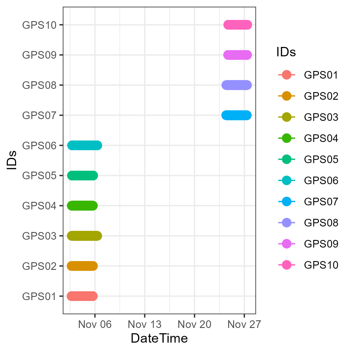
I hope this was useful for you, and if you want to go deep in some aspects of ggplot check the recommended sources below.